Project detail
Improving product discoverability in
E-commerce website
An Ecommerce website redesign that involved in improving search experience and mobile responsiveness resulting in 28% increase in revenue and 32% increase in mobile adoption.
A gym buyer in the Netherlands lands on Promofit looking for branded welcome gifts. They search. The results are overwhelming, irrelevant, or both. They leave. This was happening in 63% of sessions and it was quietly killing conversion before a single product was ever seen.
The team consisted of me (Designer), 3 Engineers, and a Product Manager. I led the design process and was responsible for
Gathering requirements and research data from clients
Defining features with Product managers and engineers
Designing the user interface for web, mobile and tablet screens.
prototyping and testing.
Assisting engineers in the implementation of the design.
One of the key focuses of this project is optimising mobile responsiveness. The traffic in mobile was very low and the clients wanted an easily adaptable mobile version of the website.
The irrelevant and overwhelming search experience was affecting the conversion and sales.
with The clients provided us primary research data which they collected through analytics, ticket records from queries and surveys. They identified these data through analytics and user reviews. The main problems were
42% of users landed on the homepage and exited without interacting with products.
Mobile responsiveness is inconsistent.
Users relied heavily on search but found results overwhelming or irrelevant, leading to high bounce rates.
63% of sessions used search but only 14% clicked results.
The design process began with discovering the usability issues with the existing website. I identified several problems with the website. And these findings matched with the analytics from the clients.

I found competitors in our client's market in the Netherlands. I noticed patterns, navigations, banners and layouts. Most of the successful competitors exhibited common UI patterns and flows.
The goal was to understand their search experience, information architecture and product customisation feature if available.
Pattern
Issue
Type A: Direct redirect to product listing
Users lose context
Type B: No search suggestions
High typing friction
Type C: Rich suggestions with previews
Helps users decide faster
KEY INSIGHT
Users benefit from search suggestions that provide product context before navigation. This allows them to preview results without committing to a page change.
This directly shaped the search redesign rather than listing results on a new page, the new experience surfaces rich suggestions in place, letting users evaluate before committing to a click
Implemented rich search suggestions including:
• product name
• variant preview
• product image
• quick link to listing page
I investigated all the competitor website for categories menu and we discussed all the pros and cons and we decided these patterns will not fit us for two reasons.
All the categories in the menu in the headers in the competitors consist of one sub-category. But our website had two levels of subcategories. Our team decided it won't suit our content.
The sticky header is so big that it takes up so much of the space in the screen. The categories rolled out, occupying the screen when users accidentally hovered over the categories leaving them frustrated.

We created a collaborative session that involves Me(Designer), UI Developers, Backend developers and a project manager to prioritise features based on effort and impact because of budget and time constraints.

I was assigned tasks in weekly design sprints which involved designing, feedback, iteration and presenting the designs to clients to get approval.
For the website to be familiar to the users in the Netherland, we kept the design similar to the other competitors in Netherland. The websites involved big fonts, bright colors and similar website structures in terms of navigation and content. I designed interfaces in such a way that it retains all the common patterns and a more clean look when compared to the old website.
The entire website was built in Magento framework. Bug fixes and other optimisations like slower loading time were also done during the development process.


A lot of information is packed in the header, increasing cognitive load for users.
Lacking visual hierarchy of elements.
Home page featuring only categories and not products.
Not optimised for mobile.

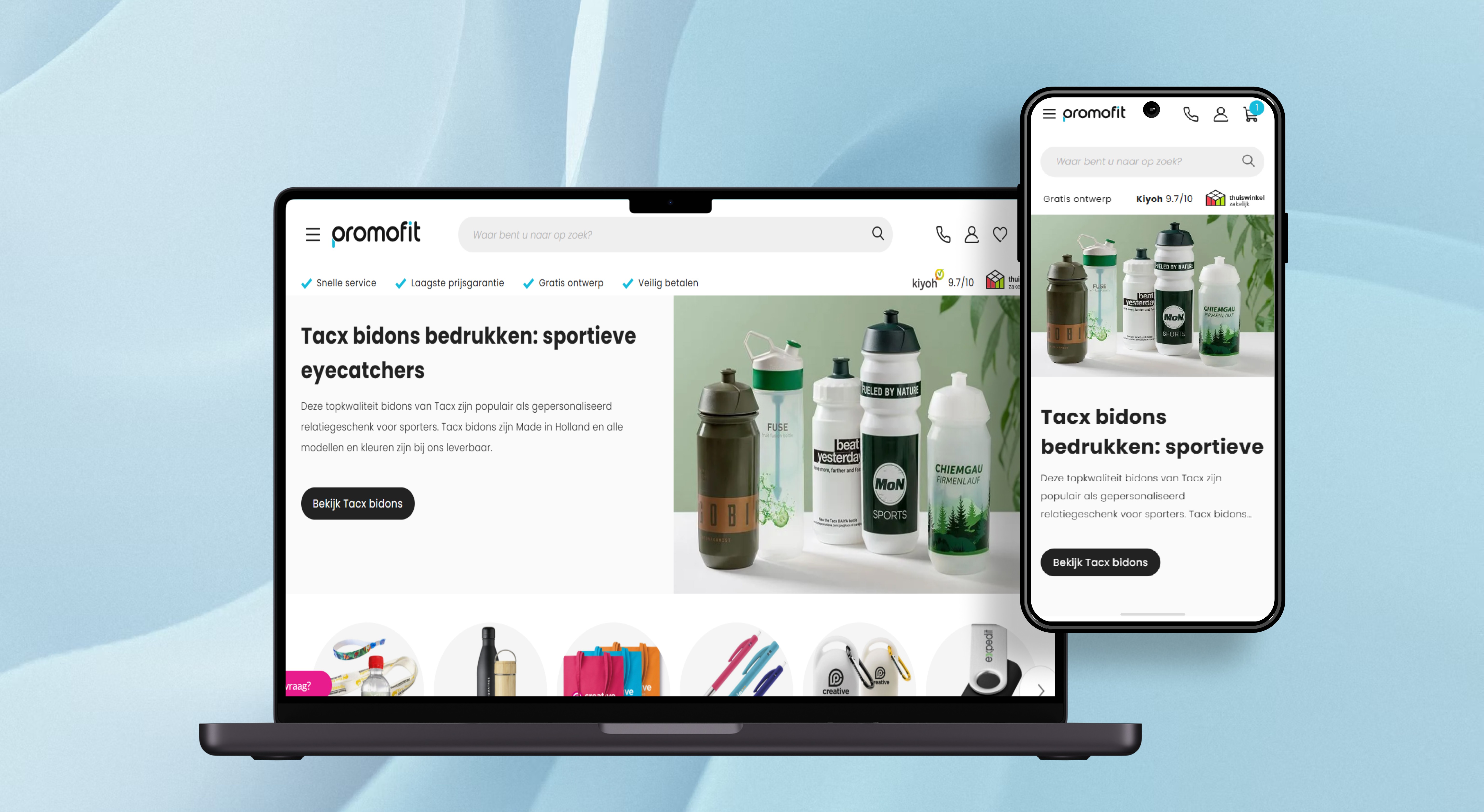
A minimalistic and clean header with a sleek logo and uniform icons for visual consistency.
The main action of the header is emphasised with search bar taking up more space.
Products are included right after hero section increasing the chance of clicking and reducing bounce rate in turn.
Highly responsve across mobile and tablet.

The focus was to
Show enough information like descriptive name, stocks remaining, comprehensive image, price of the product and number of search result.
Option for the user to view and go to the listing page at their will.

The way the competitor's website had their categories menu would not suit our website. So I had to research other patterns and interactions. I proposed the widely popular and successful pattern that Amazon follows.Since the pattern fit our content and it was widely used in ecommerce websites, this design was approved. Also it reduces accidental opening of the modal because it opens on click and not hover.

Testing happened continuously rather than as a final stage. I shared designs with colleagues as soon as individual elements were complete, getting fresh eyes on usability and visual clarity before moving forward. This saved significant time and kept the work moving in the right direction without waiting for perfect conditions.
Once the testing yielded satisfying results, we demoed the product to the clients and shipped successfully.
The following metrics measured the success of the website re-design process. These figures came directly from client analytics reviewed one month after launch.
28%
Increase in revenue through website
32%
Increase in mobile adoption
SIMPLICITY ENHANCES CONVERSION
Simplified navigation and checkout processes directly contributed to reduced bounce rates and increased conversion rates, proving that a frictionless experience drives customer satisfaction and sales.
MOBILE OPTIMIZATION IS NON-NEGOTIABLE
The significant rise in mobile conversions post-redesign demonstrated the necessity of prioritizing responsive design and mobile-first development strategies.
I DO NOT HAVE TO RELY ON PERFECT CONDITIONS TO TEST MY DESIGN
I always showed my design to my colleagues as soon as I design a new element or section to get an objective set of eyes and ask them to use the screen to check the usability and look and feel. This saved me lot of time.
CARD SORTING FOR LOGICAL CATEGORISATION
Fixing the search bar helped a lot, but I also believed that it would be more effective to fully understand why users cannot find products they were looking for. Since the categories menu plays a significant part in finding products, I would have used a card sorting exercise to group products into certain categories based on users' logic.