Project detail
A real time stress monitoring that involves a wearable and an interactive data visualising dashboard to proactively reduce the stress levels of students. This project combines a 3D wearable design and an interactive prototype of an admin dashboard.

The project was done by me and my classmate as a part of the Applied Interaction Design module, explores the evolution of learning environments, focusing on inclusivity, collaboration, and technological innovation. Recognizing the limitations of traditional classroom models, the project employs a participatory design approach to engage educators, students, and administrators in co-creating visionary solutions.
This was a group project of two people, including me. I was involved in
Facilitating design game sessions.
Conducting user interviews and secondary research.
Identifying insights.
Defining features.
UI and prototype design for dashboard.

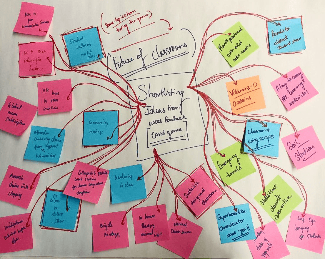
We developed Classroom Innovators, a participatory design game aimed at envisioning future learning environments. The game was designed to foster collaboration, creativity, and problem-solving among participants, including educators, students, and administrators.
The design game that we used is a card game which was designed in such a way that enables the participants to imagine future technologies and concepts. Our ideal participants were students, teachers, administrators and parents as they were the main stakeholders of a classroom. Since we could not recruit all of them, we asked students to role play as different stake holders to match the diversity as much as possible.

We conducted 3 sessions with 12 participants and encouraged them to sketch their ideas as much as possible. We recorded the sessions and documented the ideas that the users came up with. We understood what users need and picked one idea and started prototyping it.
We started brainstorming features for a stress monitoring system for students, considering wearable technologies. Initially, we thought about using ID cards with stress sensors but realized they wouldn't fit into students' daily routines.
We then discussed who would monitor stress levels, initially considering teachers. However, after talking to our professors we understood that their busy schedules made that impractical, and adding more responsibilities could increase their stress. Instead, we decided to create a dedicated staff member to focus solely on monitoring students' stress through wearables, aiming to support student well-being without adding to faculty burdens.

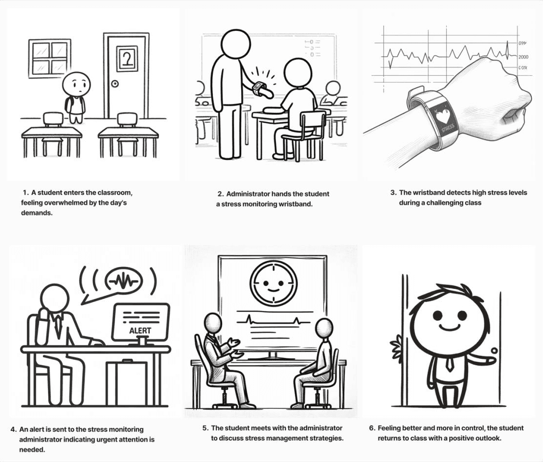
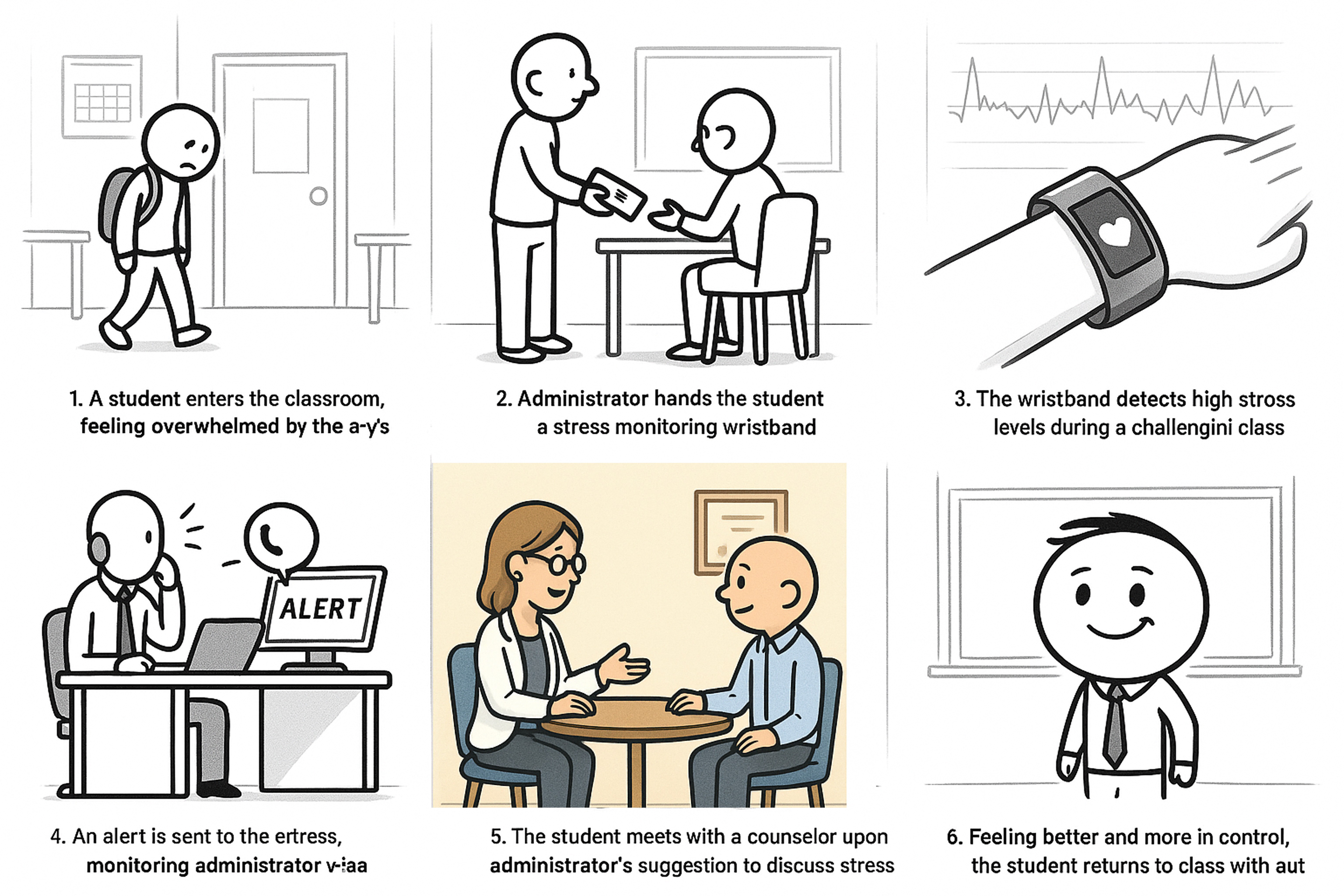
The story board describes how the system seamlessly integrates stress monitoring and interventions to help students manage stress levels.

We did some research on available wearable technologies and various interactions associated with them to identify if it is possible to monitor stress levels in real time and to design the wearable in such a way that does not feel overwhelming for the students.
We opted for a wrist wearable solution, believing it seamlessly integrates into students' lifestyles and activities. The Empatica E4 emerged as our chosen wearable Idea, equipped with a Galvanic Skin Response (GSR)
GSR and PPG sensor which measures Blood pressure value (BVP) from which Heart rate variability can be derived. Real-time data collected by the E4 is seamlessly transmitted to our dashboard through the Empatica cloud, facilitating continuous monitoring.

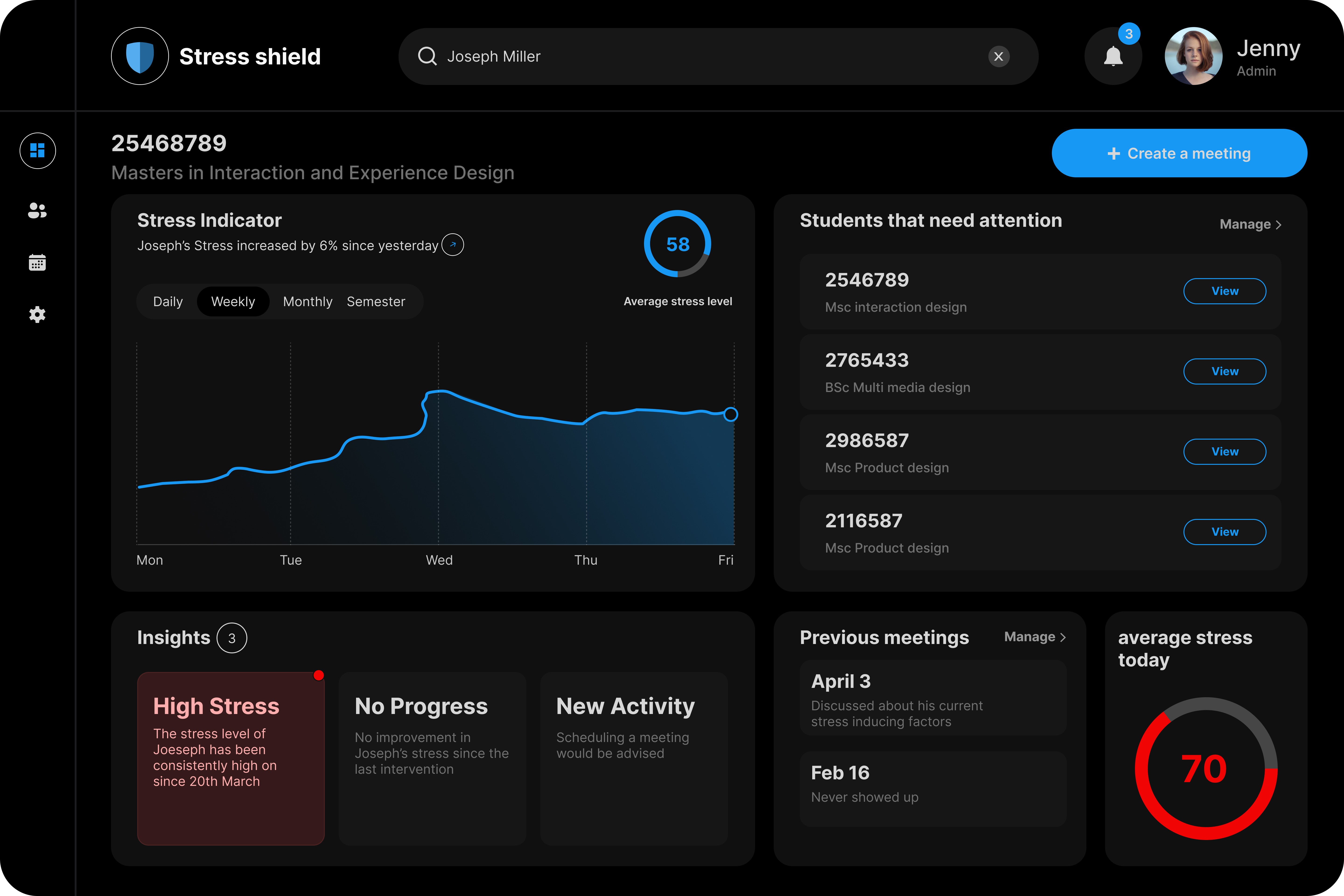
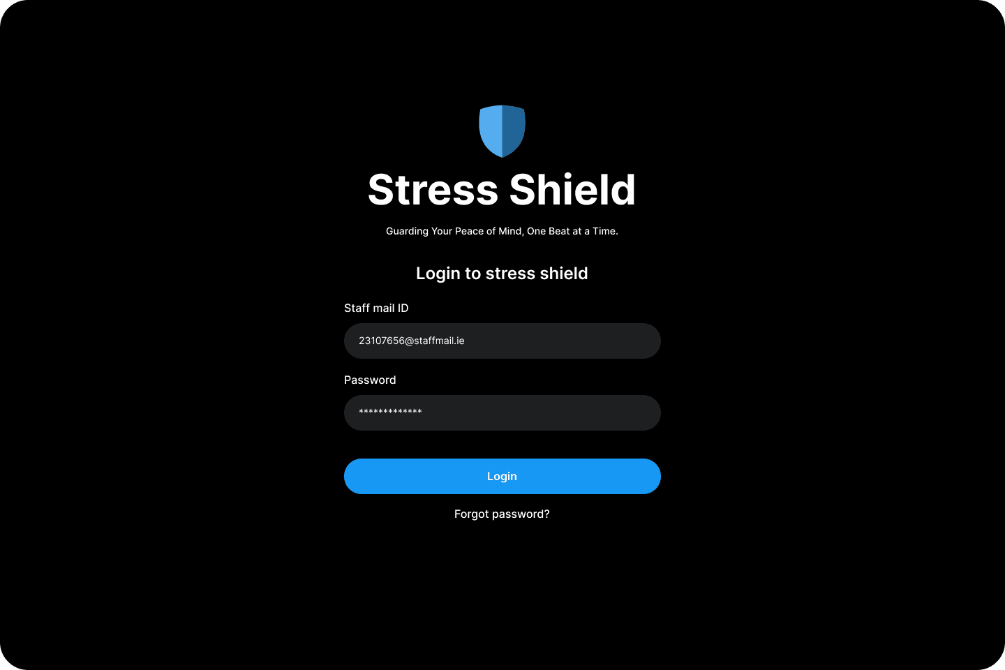
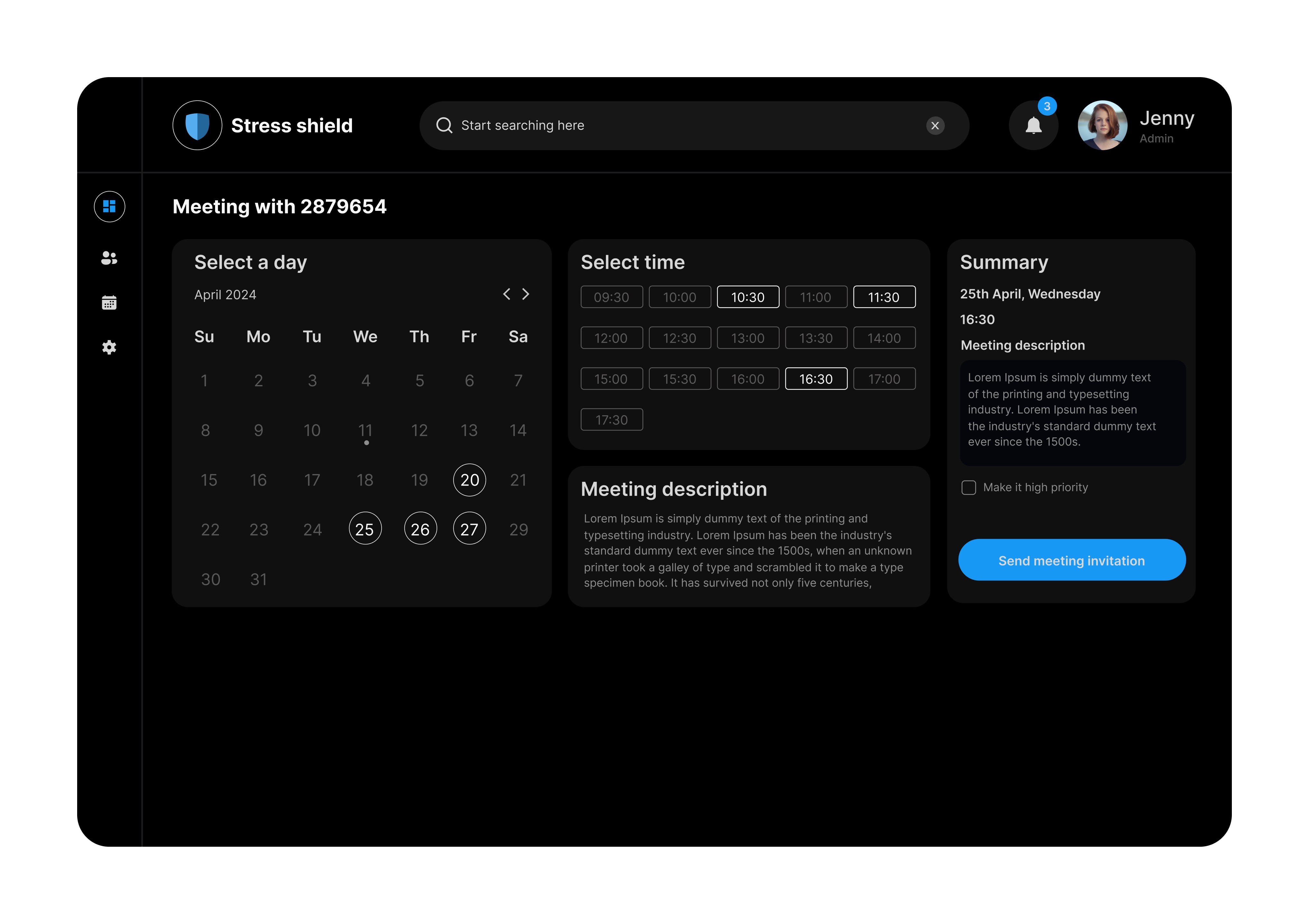
The Stress Shield MVP dashboard app provides a centralized platform tailored for the exclusive use of Mental Health Administrators within the university. Accessible only via official staff email IDs, the dashboard offers a comprehensive overview of stress levels within the class under the administrator's purview.
To begin the design process, we aimed to understand the real-world context of the primary user — the administrator. Although their existing role did not involve student wellbeing monitoring, they held valuable operational knowledge about managing daily interactions, schedules, and student behaviour within the building. we conducted a contextual inquiry to understand their workflow, goals, and challenges. This helped identify gaps that the stress monitoring system could meaningfully fill.
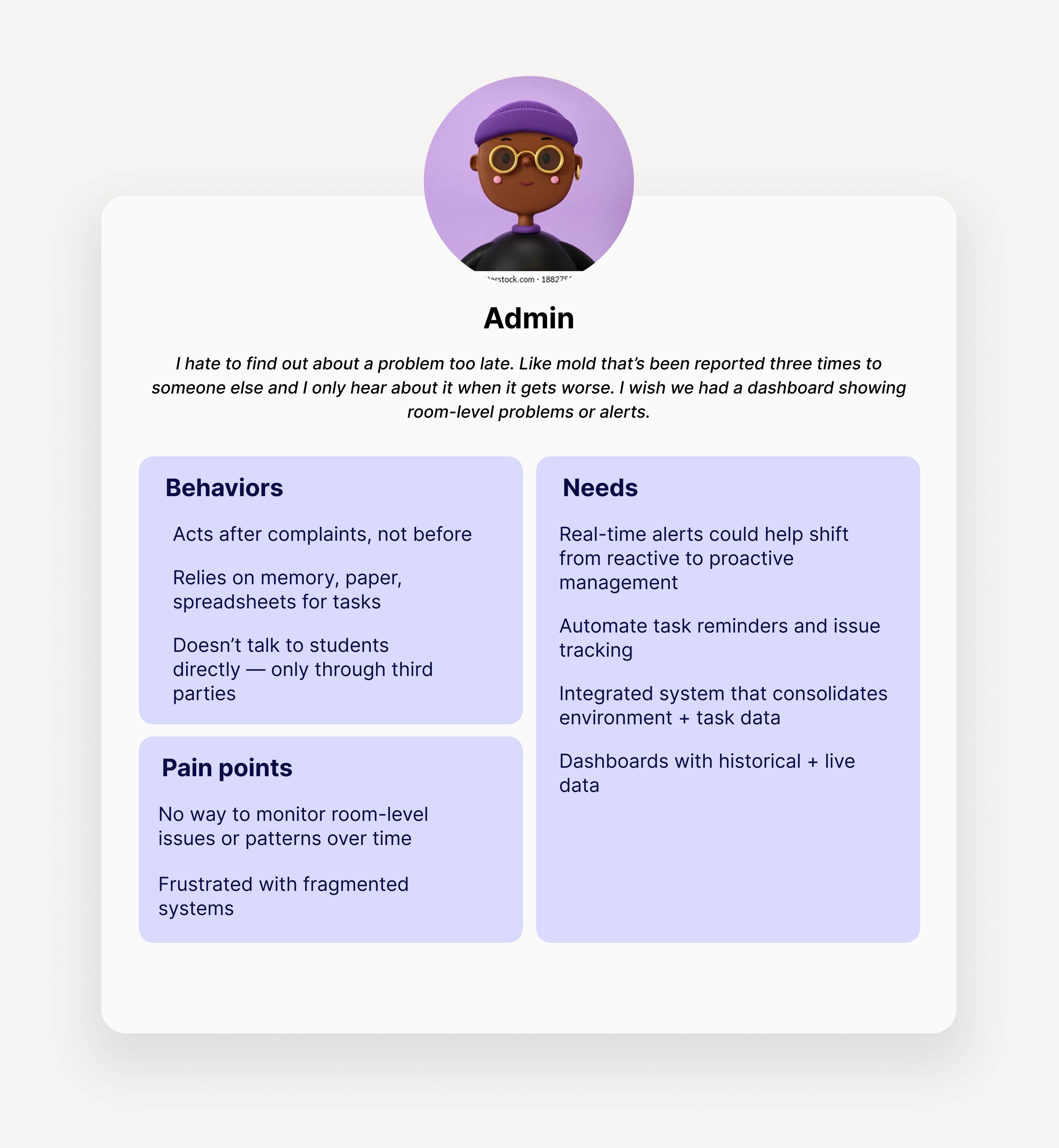
After our initial exploration, it became clear that the admin’s responsibilities and comfort zone did not align with directly managing student wellbeing or interpreting stress data. This led to a critical pivot in the narrative — positioning the admin not as an evaluator of stress, but as a facilitator who observes trends and connects students with qualified support, such as professional counselors.
Using the insights gathered from research, we conducted a structured brainstorming session using “How Might We” (HMW) questions. These questions helped frame challenges as opportunities for design solutions. For each HMW, we generated multiple ideas.
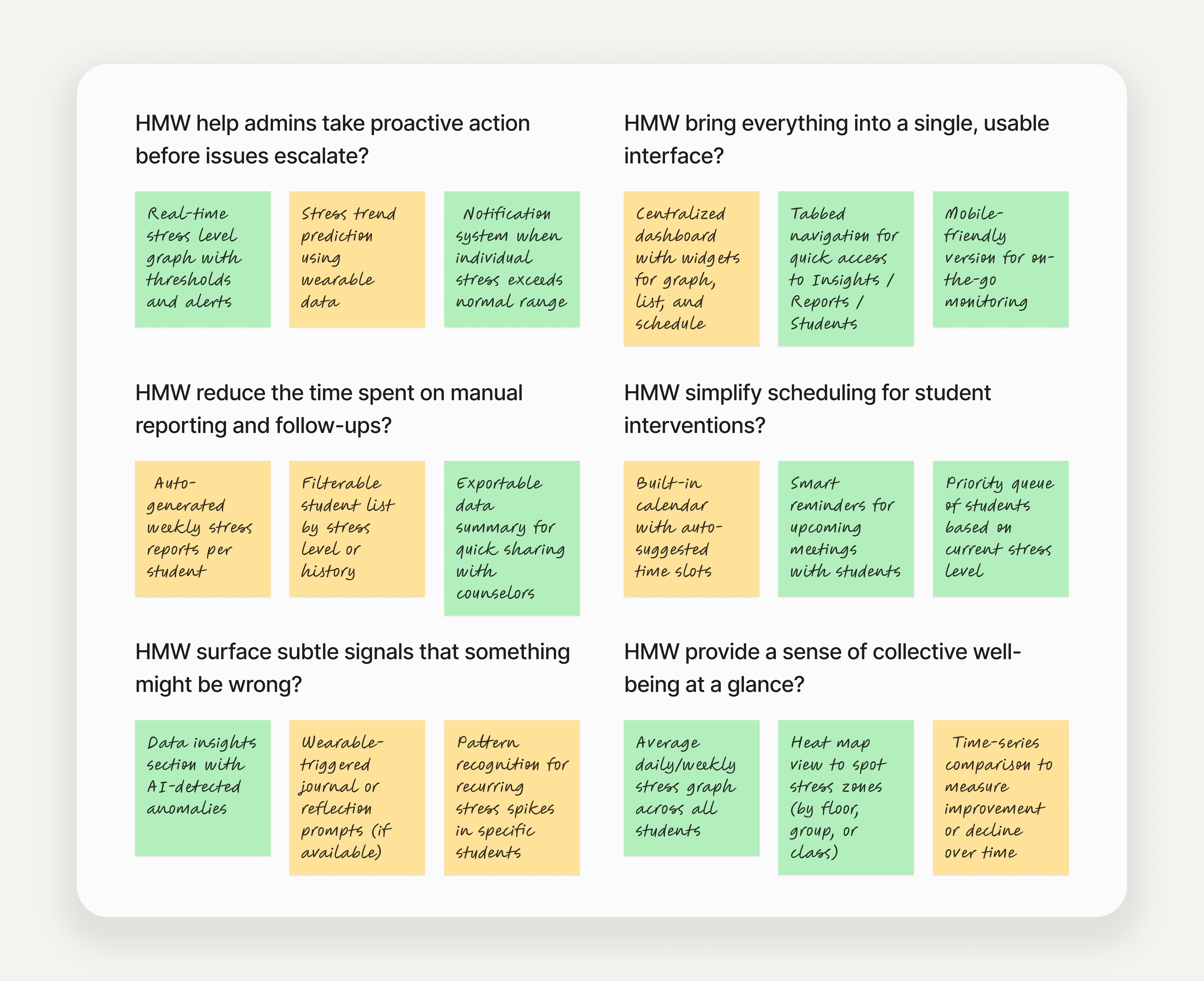
After ideation, we moved into prioritizing features to include in the first version of the dashboard. This process was guided by the user needs and potential impact on the overall system.

We created mid-fidelity wireframes and tested them with potential users to validate the layout, feature usefulness, and overall usability. The test scenarios were based on core tasks such as signing up, checking notifications, and booking meetings with students. The feedback gathered offered valuable direction for refinements in the next iteration.

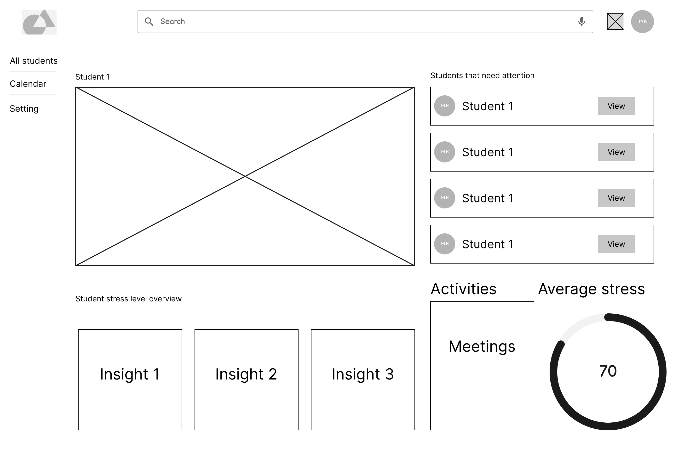


Confusion about role-based signup
Needs security assurance
Missing post-signup feedback
No way to add description for the meeting.
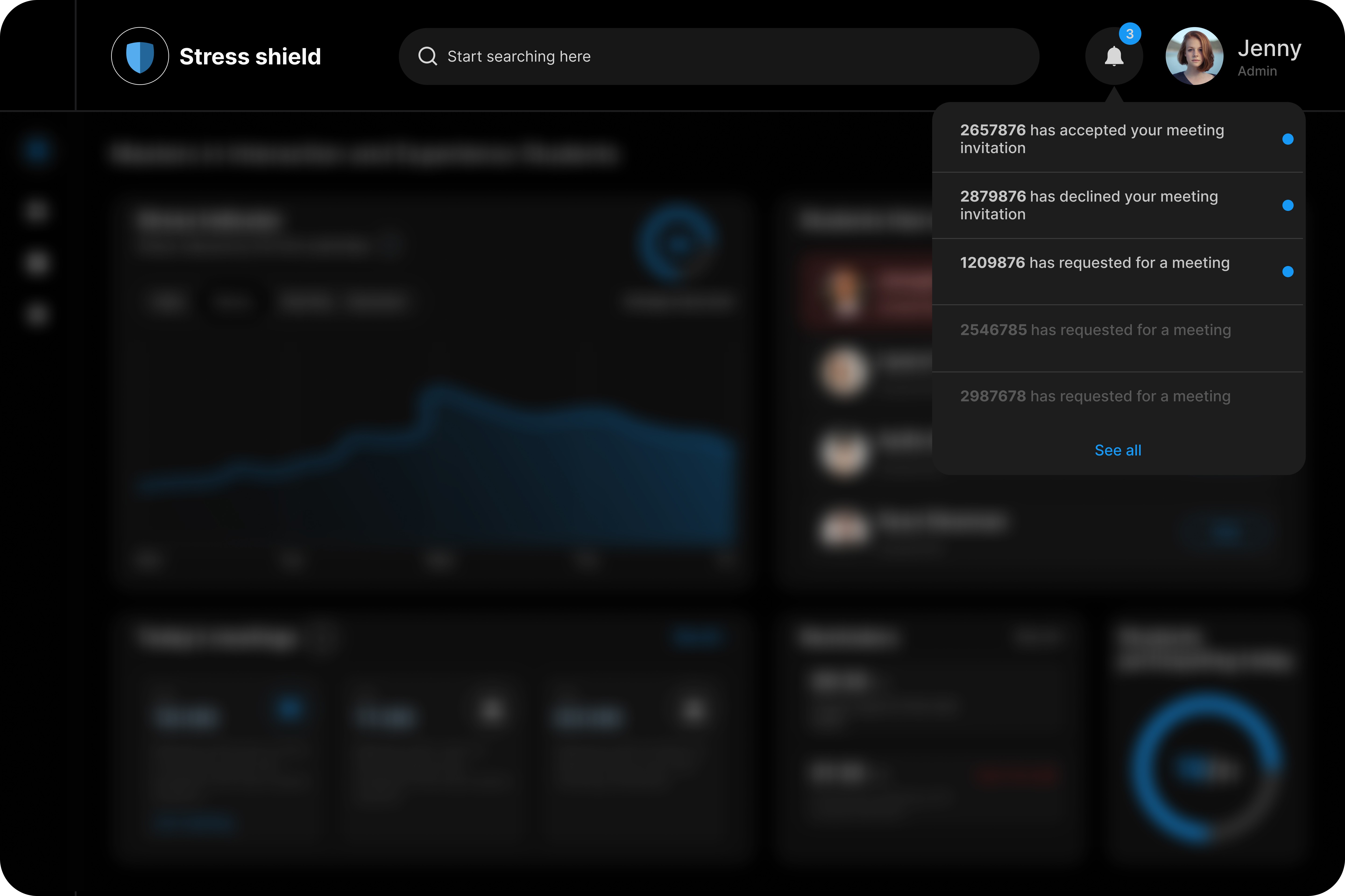
User Can't find the notification button at first.
After wireframing, and testing, we transitioned into the UI design phase to translate core functionalities into a visually engaging and user-friendly interface. The goal was to craft a clean, accessible, and professional dashboard that supports the admin's day-to-day tasks without overwhelming them.
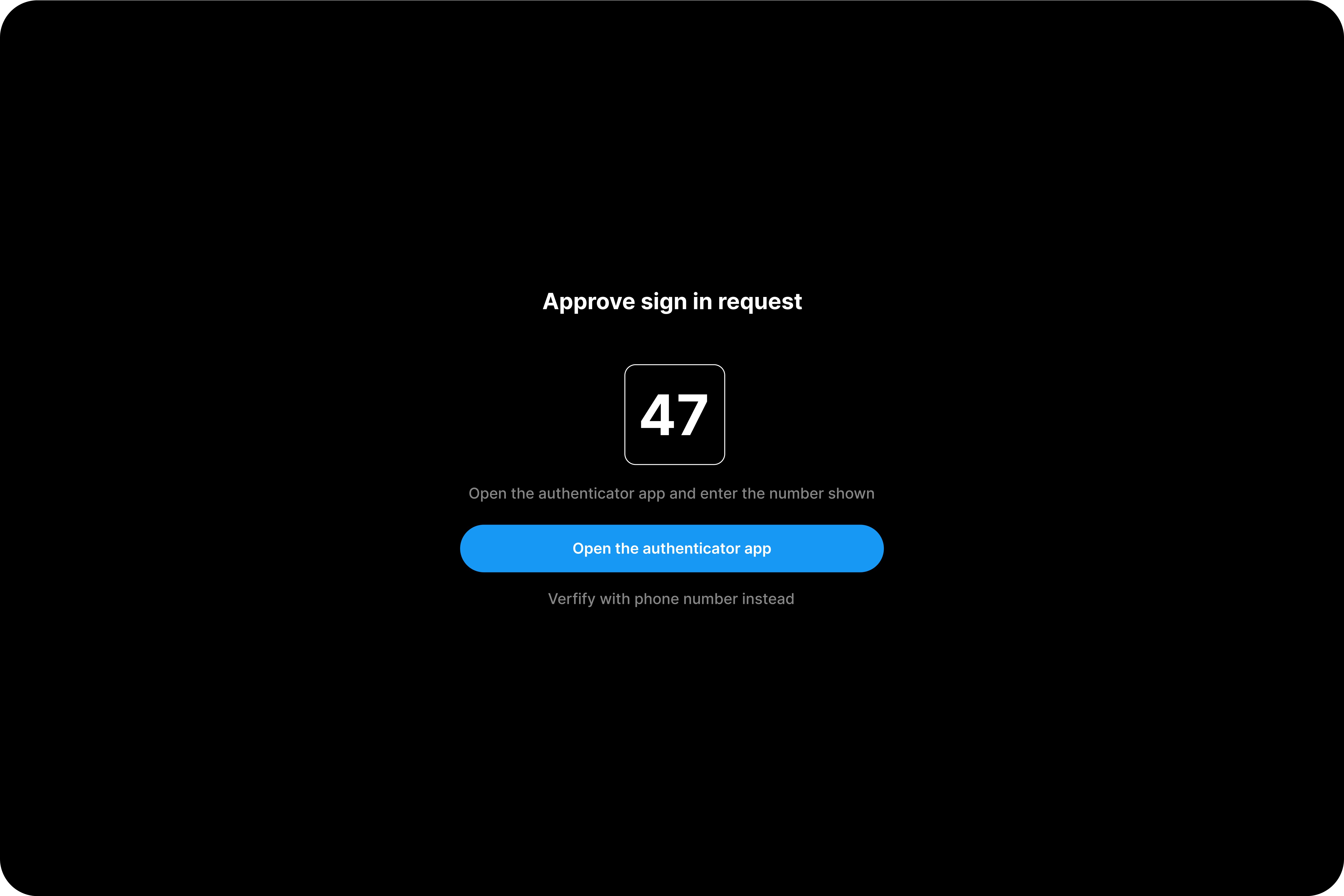
Since the wireframe testing revealed that the admin needs security assurance, I added an extra authentication step.
Clear labels were used to eliminate the role based confusion.

We got positive feedback on the wireframe testing for this flow except it lacked meeting description box. So, we went ahead and designed the UI screens for them.
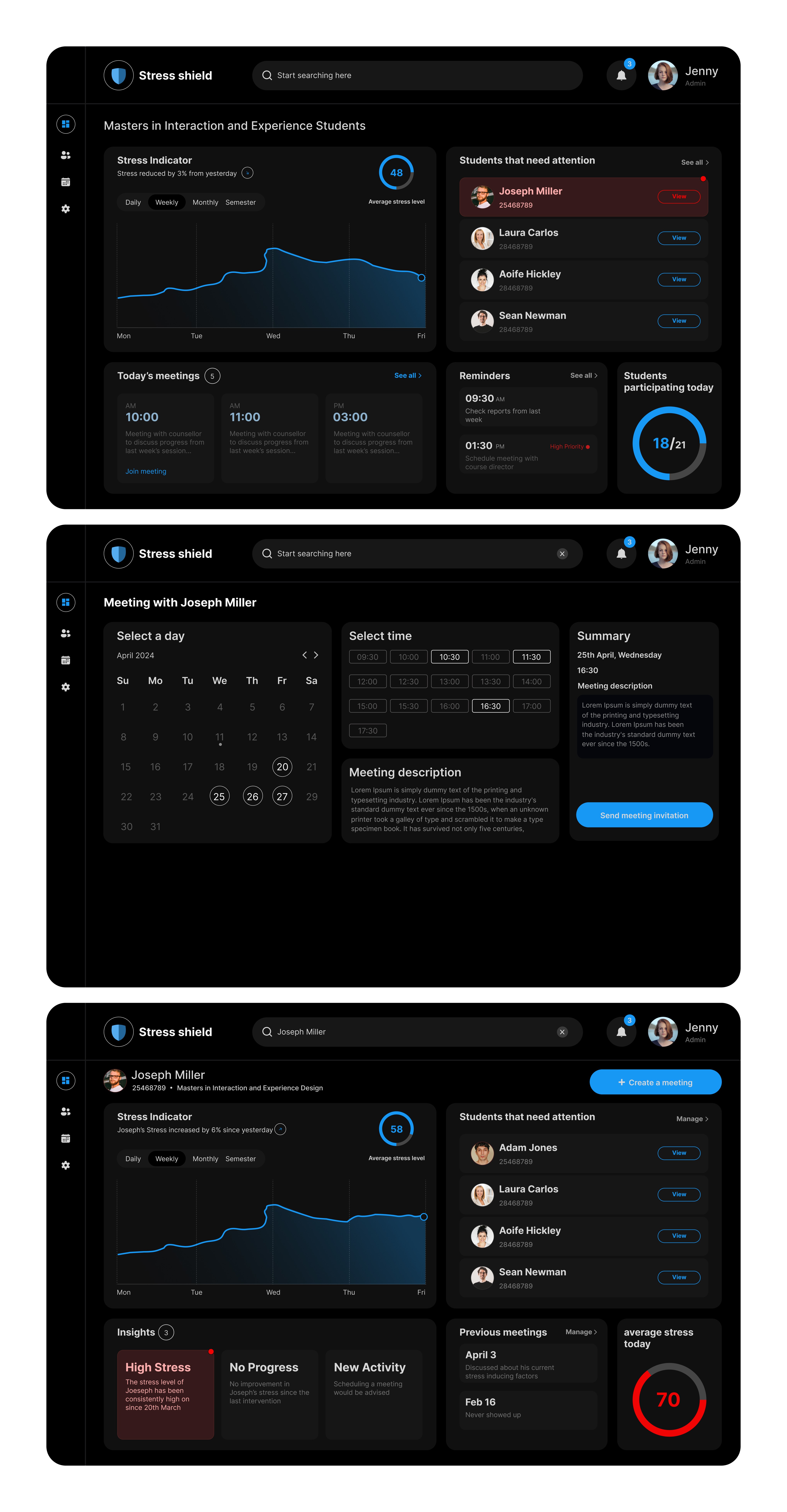
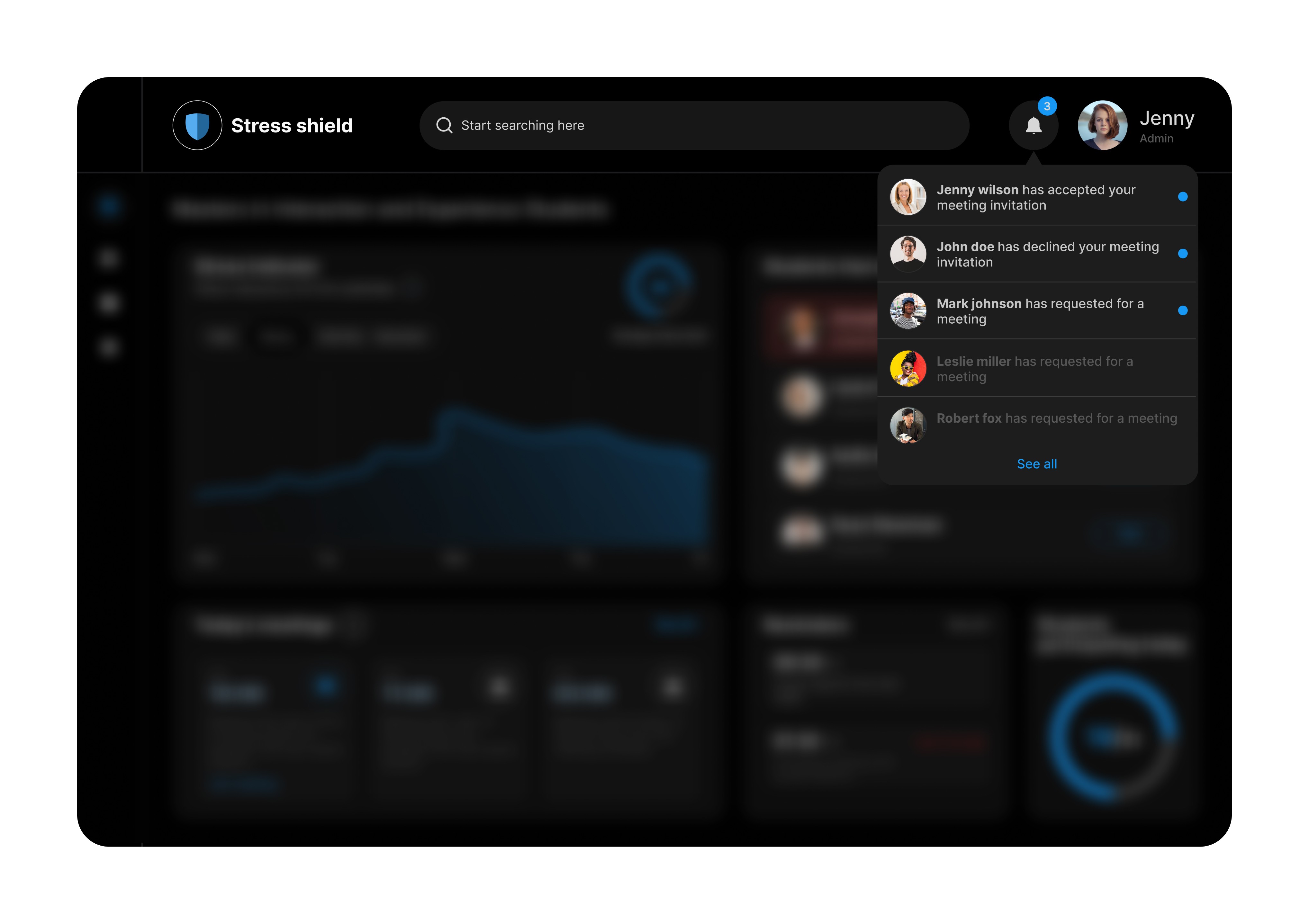
The user could not find the notifications because of the lack of icon in the mid fidelity wireframe. The UI design incorporates clear iconography and alerts.
We created the screens and an interactive prototype in figma. We asked the user to perform the same tasks we asked earlier. He successfully completed the task but he gave us few valuable feedbacks.
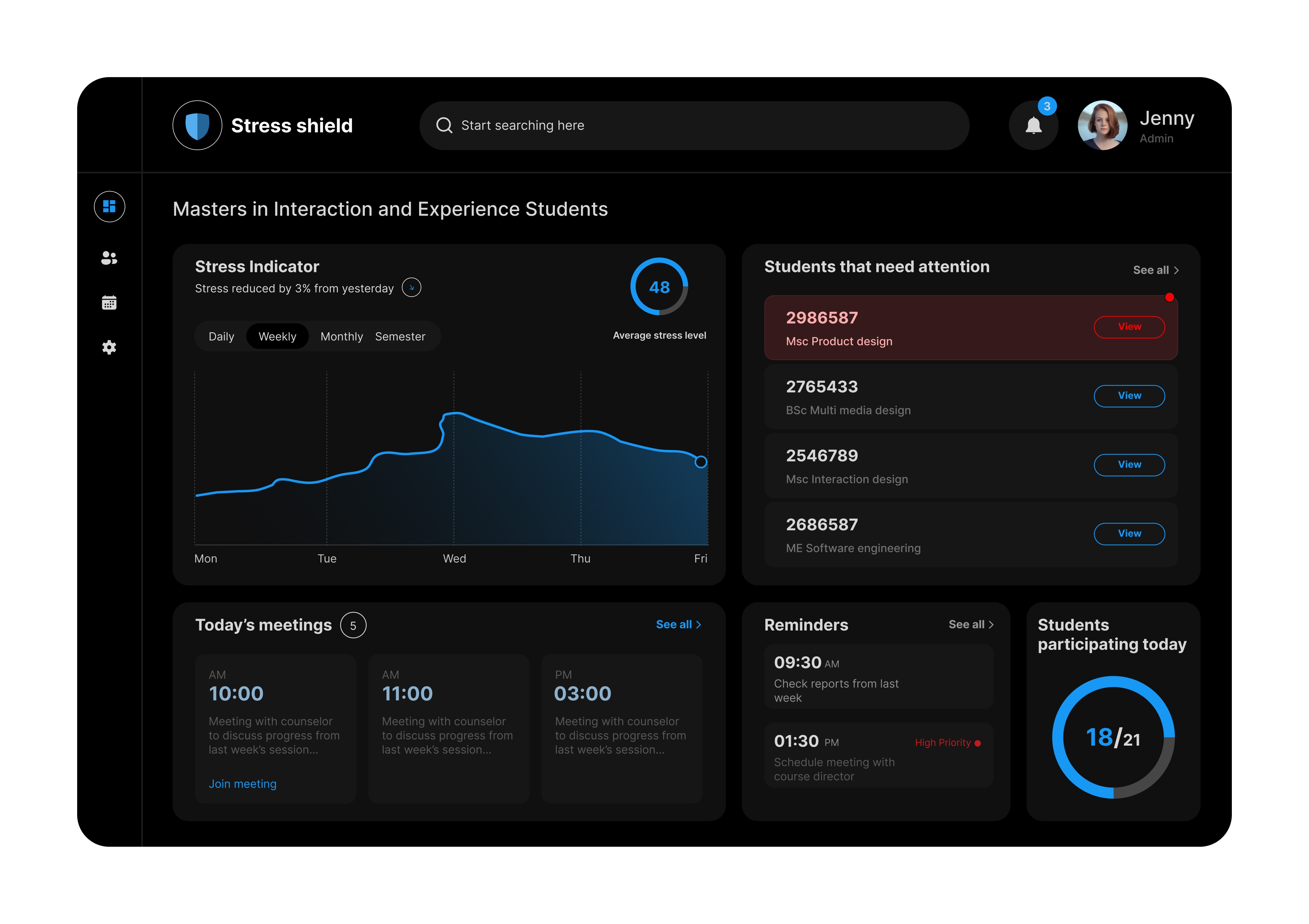
The user felt that the profile pictures and names are privacy concerns.
He wanted a way to prioritise meetings to focus on most important things first.
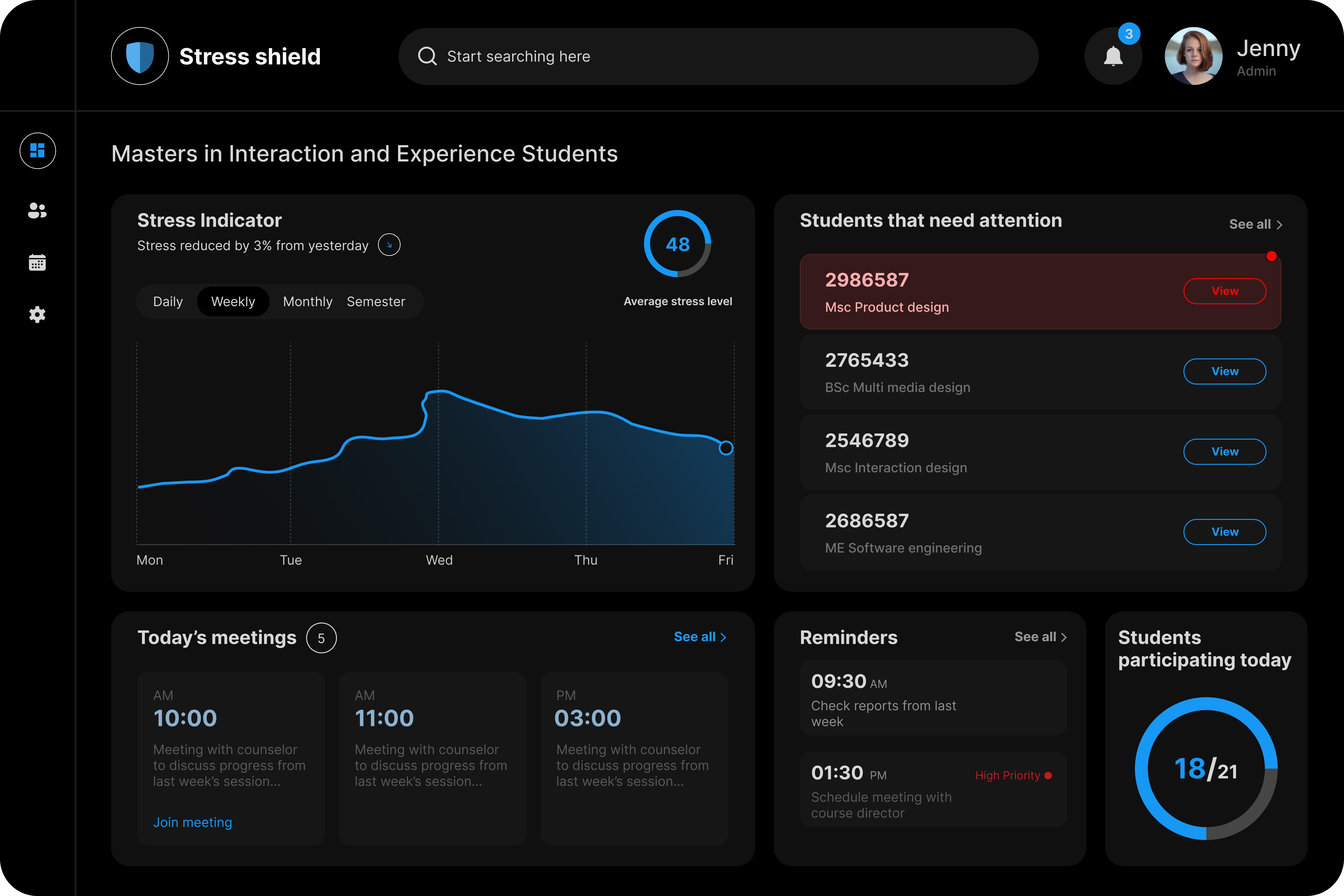
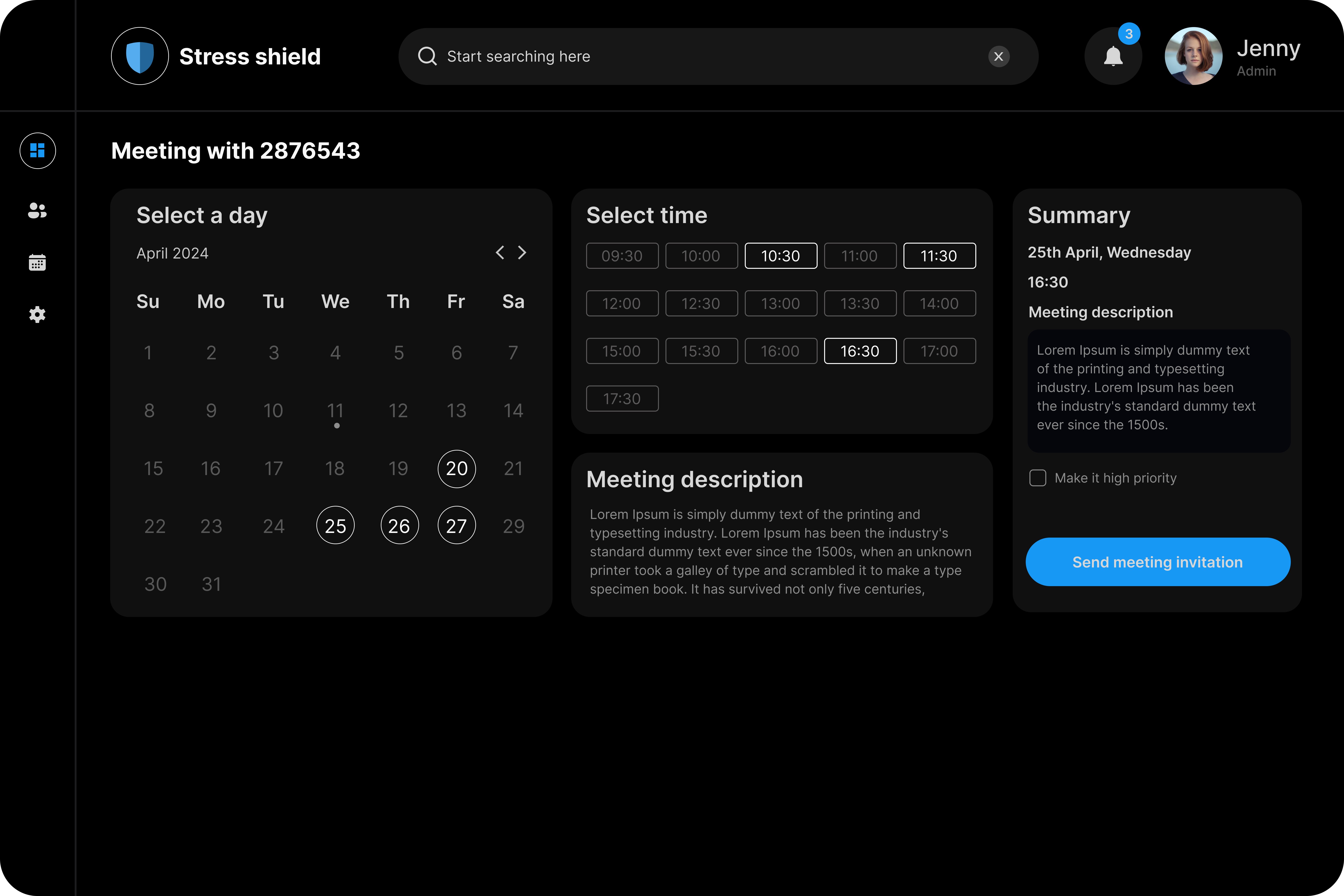
We removed the images and names of the student for anonymity and privacy concerns. We decided that student's registration number would be adequate for the admin to intervene.
While scheduling a meeting, the user needed a way to prioritise meetings based on urgency. We included a check box that lets the user to make it a priority meeting.
Designing for Non-Experts in Sensitive Domains
Admins were uncomfortable acting on health data without proper training. Assumptions about their role led to initial mismatches in design. This helped us to refocus the system toward referral rather than intervention.
The Power of User-Centered Iteration
Early feedback shifted core features and responsibilities. Wireframe testing revealed usability gaps (e.g., unclear booking flow). Multiple iterations led to a more intuitive, role-appropriate dashboard.
Empathy over assumption
Realized that listening > designing early on. Acknowledging user boundaries built trust and relevance into the design. Designed features that support, not burden, the admin.